Visual Impact, Lasting Impressions: Design That Defines
Transform your visual communication with Round Branding’s Graphic Design services. From captivating packaging to dynamic digital media, our designs ensure your brand not only stands out but speaks directly to the hearts of your audience.
Let us elevate your visuals to reflect the excellence of your brand.

Our Graphic Design Philosophy

Our approach to graphic design focuses on creating visually compelling and brand-aligned designs that captivate and communicate effectively.
We ensure that each design element enhances your brand identity and resonates with your target audience.
Innovative designs that stand out.

Ensuring visual elements are consistent with your brand’s identity.
Designs that effectively communicate your brand message.
.svg)
.svg)
OURDESIGNPROCESS
We start by understanding your needs, goals, and vision for the project.

We brainstorm and develop initial design concepts that align with your brand.
Our designers bring the concepts to life, creating detailed and visually appealing designs.
We collaborate with you to refine the designs based on your feedback, ensuring satisfaction.
We deliver the final designs in the required formats, ready for implementation.
OURAREASOF EXPERTISE
We specialize in a variety of graphic design services to meet all your branding needs. Whether it's logo design, marketing materials, or digital assets, our team ensures high-quality, impactful designs.
Crafting unique logos that serve as the cornerstone of your brand identity.

Designing brochures, flyers, and promotional items that effectively communicate your message.
Creating engaging graphics for websites, social media, and online advertising.
ENSURINGYOURSATISFACTION
From the initial consultation to the final delivery, we prioritize your satisfaction. Our iterative design process ensures that your feedback is incorporated at every stage, resulting in designs that meet your expectations and drive results.
Understanding your vision and requirements.

Collaborating with you through multiple design iterations.
Ensuring the final design aligns with your vision and goals.
SuccessStories

Client
VIA VENETO
Challenge
The primary challenge was to redesign Via Veneto’s brand identity to reflect its historic Italian charm and modern dining experience. The goal was to create a unique, cohesive visual language that not only pays homage to its Italian origins but also appeals to contemporary consumers.
Solution
Results
The system includes diverse shapes and logo lockups, ensuring flexibility across different media. This includes menus, signage, social media, and the website, maintaining brand consistency and recognition. Each element, from stationery to packaging, features bespoke Art Nouveau-inspired artwork that reinforces the café’s unique identity.
Via Veneto’s revitalized brand identity is a testament to how traditional elements can be seamlessly integrated into modern design. We are proud to have contributed to the rebirth of this iconic café, helping it stand out in today's competitive dining scene while staying true to its roots.
Client
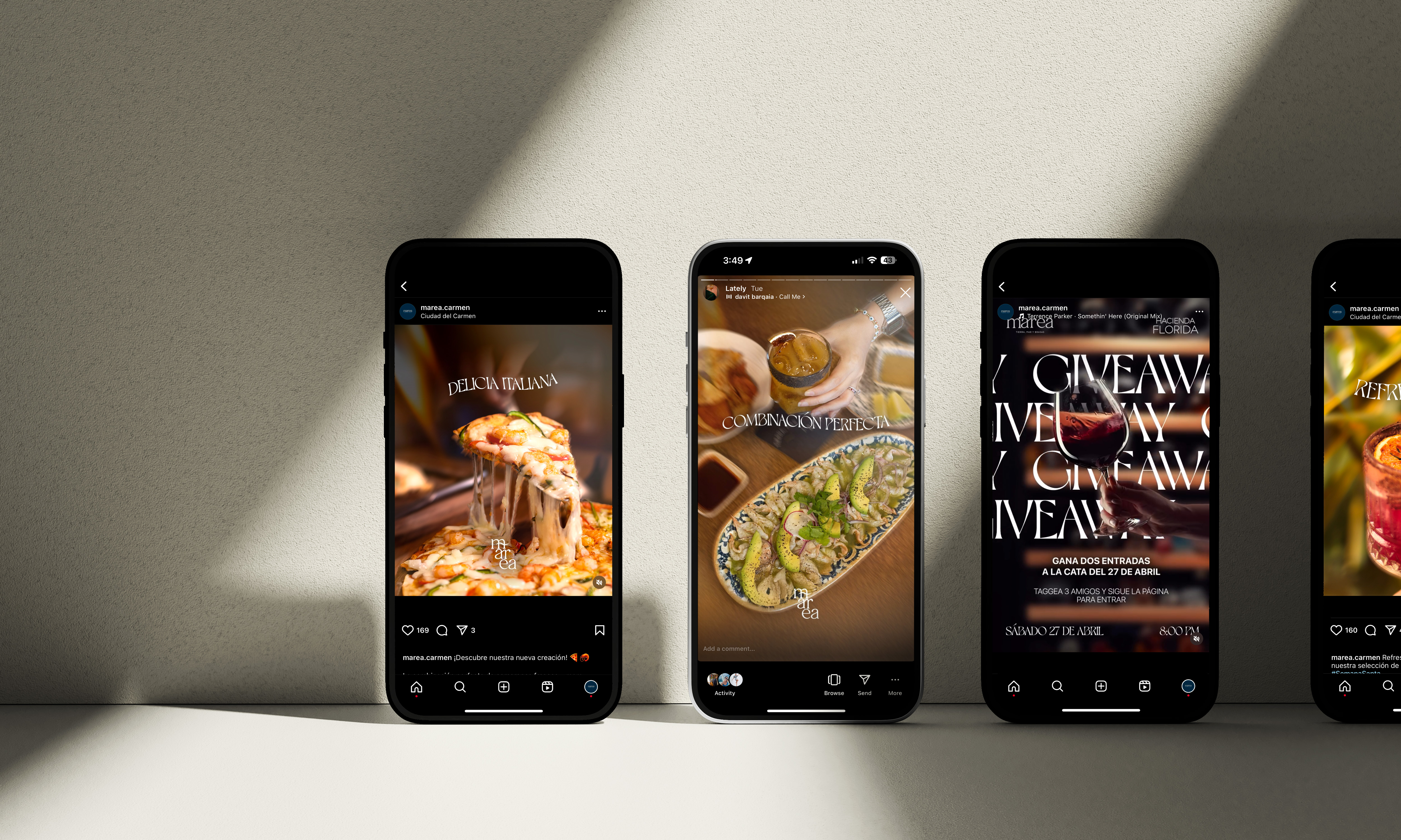
Marea
Challenge
We kicked off with a brand strategy workshop to identify the unique space Marea could occupy in the local dining scene. Our primary strategy involved focusing on social media marketing tailored for the local market, rather than chasing global reach. This approach ensured that every piece of content spoke directly to the lifestyles and preferences of Marea's target audience.
1. Audience Definition and Market Analysis
We mapped out Marea’s ideal clientele, understanding that their needs differed from typical restaurant patrons. This in-depth audience analysis allowed us to craft content that genuinely connected with them.
We conducted a competitive market analysis to identify what nearby restaurants lacked and where Marea could differentiate itself.
2. Content Strategy and Execution
Visual Appeal: We emphasized high-quality images of Marea’s dishes to create a strong visual appeal. Our images and videos highlighted not only the quality of the food but also the ambiance.
Localized Messaging: Our social media messaging catered to Marea’s target demographics, with messages that resonated with the lifestyle and dining preferences of the local community.
Engaging Reels & Videos: We produced engaging reels with visual hooks, focusing on shareable, visually striking content that encouraged local customers to interact and share with friends.
Solution
Marea was looking for a strategy to establish a presence within their local community of 250,000 people. They sought to reach three main audience segments:
- Women aged 40-60, looking for elegant social dining options.
- Businessmen needing a setting suitable for client meetings and business discussions.
- Families seeking a comfortable, high-quality dining experience, especially for weekend gatherings.
Our goal was to help Marea attract these specific local demographics, not through viral or globally appealing content, but through targeted social media strategies that resonated with the community and drove them to visit.
Results
Within a span of just nine months, Marea achieved the following results:
Sales Tripled: Marea’s sales increased threefold since our collaboration began.
Increased Foot Traffic: The restaurant tripled in visitors.
Organic Social Growth: Over 2,000 organic followers gained on social media, enhancing Marea’s brand presence.
High Engagement: Our content garnered over 150,000 impressions, with positive community feedback on social platforms.
Our partnership with Marea demonstrates how a strategic, locally-focused social media approach can transform a young restaurant’s presence within its community. By aligning our strategy with the dining preferences of the target audience, Marea has become a sought-after location for business meetings, social gatherings, and family meals, solidifying its position as a valued part of the local dining scene.
.avif)
Client
Logisa
Challenge
Despite their expertise, LOGISA's outdated brand identity was not reflecting the modern, dynamic, and professional image they aimed to project to attract top-tier clients.
The main challenge was to modernize LOGISA’s brand identity to resonate with major technology companies while preserving the legacy and essence of the family business. The brand needed a transformation that would not only refresh its look but also communicate reliability, innovation, and sophistication.
Solution
Results
The main challenge was to modernize LOGISA’s brand identity to resonate with major technology companies while preserving the legacy and essence of the family business. The brand needed a transformation that would not only refresh its look but also communicate reliability, innovation, and sophistication.

Client
Jorge Elizondo
Challenge
Solution
Results

Client
Nestra
Challenge
Nestra Residences is a cutting-edge student housing complex that reimagines academic cohabitation and our collective bond with Yucatán's vibrant culture. Situated in the heart of Mérida, a city renowned for its rich Mayan heritage and colonial landmarks, this multifunctional development boasts a revolutionary architectural design by the renowned TAMA Group. Round has conceptualized a vibrant branding program for the project, complete with a graphic identity reflecting the dynamic ethos of Nestra and both print and digital content emphasizing its holistic approach to student well-being.
Solution
Results
We must understand our identity as a large ecosystem where every touch point is key. The small details are as relevant as the logo, from the color that awakens creativity, to the texture and weight of the materials of our diffusion pieces. For this reason, a dynamic system is what Nestra needs to cover all the day-to-day communication.

Client
Roundbox
Challenge
Roundbox has been working for the past five years to deliver high-quality videos that help companies position themselves in a way that achieves their business goals. In a crowded industry, it’s our job to show the power of video. We want to become the go-to production company for agencies and startups that are looking to create content to showcase their product or service in a fun, creative and successful way. We created a unique, cutting-edge identity that agencies and startups identify with, and become their first choice to help them achieve their business goals. An identity that positions Roundbox as a high-end social media content production company.
Solution
Results
We created a series of icons that represent an abstraction of the elements that are used both in production and post-production in the work of the brand. Among them are camera lenses, editing, flash and focus style of each camera. The icons are the complements that accompany the logo. They should always be a secondary that can be used in applications that have to do with the brand. It should never be replaced with the logo, but it can be handled in the most creative way without stealing prominence from the logo.

WHAT OURCLIENTS SAY
.svg)